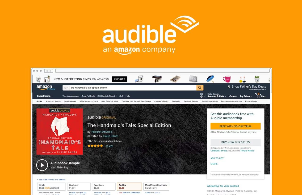
Audible had focused for years on making a simple checkout experience. There were various hurdles to purchasing an audiobook on Audible.com and Amazon.com that add complexity. While my Amazon team had managed to simplify the user experience for learning about an audiobook and purchasing, we knew that Audible wasn't being seen as the media brand it deserved to be. Audible was making a large push into exclusive content to establish itself as a media brand. I knew it was the right time to consider optimizing our product detail pages to give a better user experience.
After countless hours of research, running design studios with various teams, and concepting, we landed on a redesign which was scalable to 200k titles, utilized a modular design system to easily test how each change affected numbers, and had listening and cleaner checkout at the forefront. With content first flows being a key driver for the Audible business and a primary need for the user, this was an important project that would help engage users more deeply than the transactional checkout experience provided by the control.
Our team looked at our current experiences on Amazon, checked heatmaps to understand dwell depth and time, reviewed analytics, and interviewed users to better understand audiobook checkout behavior. After designing immersive audiobook experiences for major titles, we moved into more scalable designs for the 200k+ titles in the Audible catalog through a modular design system.
.avif)
.avif)
.avif)
.avif)
%20(1).avif)
.avif)
.avif)
.avif)
.avif)